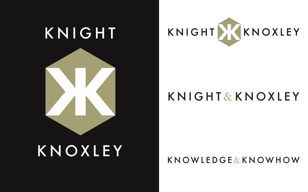
New Company Brand Identity
Knight & Knoxley - August 2015
I was approached by Nathan, who was setting up his own estate agency in central Brighton (Preston Circus) and was looking for advise and practical help on how he should brand the new company.
He already had a name he and his investors were keen on, and also had an idea of what he wanted his brand to 'say' - which was a great starting point.
Over the course of 6 weeks, I worked closely with Nathan and his colleague to come up with font choices, brand style guidelines and colours, and their marque & logo - which in the end needed 3 variants; portrait, landscape and an unmarked version for use in text only situations.
From numerous productive conversations around brand ethos; their interest in social regeneration, and their target audience i developed the shield marque. This can be used on its own or with the logo on everything they produce from business cards, property boards and brochures to social media and aggregation sites.
